Common Errors in Technical Writing John Owens
LaTeX is a wonderful system for text processing. English is a beautifully expressive language. However, in reviewing and reading many papers, I often see the same errors, over and over again. Especially for my students ... please don't ever give me your paper to read that has any of these errors.
A wonderful book for the details of technical writing is Mary-Claire van Leunen's A Handbook for Scholars, currently in its second edition from Oxford University Press.
I separated out bibliography issues into a separate file.
Annoyances in Text
et al.: Number one pet peeve: Indicating “and others” in citations. If you cite one author in body text, it should be “AuthorOne”. Two authors: “AuthorOne and AuthorTwo”. Three or more authors: “AuthorOne et al.” (although, for three authors, I understand “AuthorOne, AuthorTwo, and AuthorThree” is OK). “et al.” stands for “et alia”. It does NOT have a period after “et” and DOES have one after “al”.
Interword spaces: “TeX assumes a period ends a sentence unless it follows an uppercase letter.” (Lamport p. 14) So, put a \_ (where _ means “space”) in a sentence like Smith et al.\ say that .... And, if an uppercase letter ends a sentence, do a \@ before the period: In the class, I gave Bob a C\@.
First person, passive voice: Please write in first person and avoid the passive voice. Academic writing does not have to be stilted and boring. Chicago Manual of Style: “When you need the first person, use it. It's not immodest to use it; it's superstitious not to.” Simon Crowley: “Every time you use the passive voice, a kitten is killed by God.”
Avoiding the first person used to be considered proper, but now it's considered very formal, if not old-fashioned. It's not a question of correctness, however; both styles are correct. If you feel strongly that the first person is out of place in your work, don't use it. —Chicago Style Q&A, December 2010
Hyphenation: “We built a high-performance implementation.” “high-performance” is hyphenated because “high” modifies “performance” not “implementation”. It's not a “high implementation”. Here, “high-performance” is an adjective. But: “Our implementation has high performance.” Here, “performance” is a noun. No hyphen. Similarly: “throughput-oriented workloads” or “GPU-based implementation”.
For some words, it's not clear if it should be hyphenated or not (e.g. “e-mail” vs. “email”). The general trend in English is to move toward non-hyphenation (e.g. “to-morrow” became “tomorrow”) so if I'm unsure, I usually trend toward non-hyphenation.
Reyes not REYES: Pixar's micropolygon-based renderer should be referred to as Reyes not REYES. Unfortunately, it is commonly referred to with both spellings, so I checked with Rob Cook who definitively said “Reyes” and pointed me to the paper that introduces Reyes.
Serial comma: “The serial comma is the comma used immediately before a coordinating conjunction (usually and or or, sometimes nor) preceding the final item in a list of three or more items.” (Wikipedia link.) Strunk's second rule is “In a series of three or more terms with a single conjunction, use a comma after each term except the last.” Wikipedia notes that in non-journalistic American English, this is the norm. Kurt Akeley's logic on this is quite sound:
People think they can ignore this rule, and insert the serial comma only when additional conjunctions complicate things, such as “A, B and C, and D.” But this isn't true, because if the reader doesn't trust you to always include the serial comma, then scanning up through “A, B and C” is ambiguous until either a comma or a period is reached. You shouldn't have to read past C to understand that B stood alone! To avoid this ambiguity, a writer must always include the serial comma.
Use of the word “only”: Be precise with this word! For example, “I only eat apples” and “I eat only apples” do not mean the same thing. Most write the first when they mean the second. For the record, the first means that the speaker does nothing but eat apples. (Thanks to Kurt for this one too.) (And Tony Smith adds that “The former, ‘I only eat apples’, also distinguishes between those that utilise apples only as a solid food for themselves from those that also (or instead) juice them, make cider from them or feed them to horses.”)
Annoyances in References & Bibliography
Also see Dan Wallach's thoughts on the matter.
Citations as words: Number two pet peeve: Using citations as words. van Leunen again: “Brackets are not words. A bracketed number is just a pointer, not a word. Never, ever, use a bracketed number as if it were the name of an author or a work.” (p. 20). So instead of “A similar strategy is described in [15].”), use instead “A similar strategy is discussed by AuthorOne et al. [15]”. The way you can get this right in your head is considering a journal that does citations as superscripts (like the old Graphics Hardware style). It looks really stupid to say “A similar strategy is discussed by 15.” I don't like this particular style for citation, but it does make sure citations aren't used as words.
Latin and italics: “et al.” is not italicized or underlined (van Leunen, p. 27: “Write it without either underlining or italics.”; Chicago Manual of Style 7.56: “Commonly used Latin words and abbreviations should not be italicized. ibid, et al., ca., passim.” [and later, 6.44: “Note that ‘e.g.’ and ‘i.e.’ are not italicized.”]).
Scott Pakin also asked me to note the difference between i.e. and e.g., which contrary to popular belief aren't synonymous: “id est” means “that is” and “exempli gratia” means “for example”.
Sorting your references: If at all possible, arrange your reference list in alphabetical order by author's last name. Going in cited order is much less useful to readers of your paper. The only reason I've heard that cited-order is useful is in a survey article where nearby (and presumably related) citations from the paper are next to each other in the bibliography. I don't find this argument particularly compelling.
Citing with LaTeX: When writing citations in LaTeX, do them in this form:
text text text~\cite{Foo:2000:BAR}
The ~ means non-breaking space (which is what you want -- you don't want a linebreak between the text and the citation).
Also, do \cite{AuthorOne:2000:ABC,AuthorTwo:2002:DEF} instead of \cite{AuthorOne:2000:ABC}\cite{AuthorTwo:2002:DEF}.
Always alphabetize grouped citations so they appear in numerical order (instead of [8, 6, 10], arrange the citations so it looks like [6, 8, 10]). \usepackage{cite} supposedly puts them in proper order for you automatically (!) and also changes [1,2,3,4,6] to [1-4,6] which is handy.
Never use the ACM Digital Library's citations without fixing them. For some reason the First Society of Computing has zero interest in making their capitalization correct. For instance, the first paper I ever wrote, according to ACM, has the following title and booktitle:
title = {Polygon rendering on a stream architecture},
booktitle = {HWWS '00: Proceedings of the ACM SIGGRAPH/EUROGRAPHICS workshop on Graphics hardware},
when the paper has the major words in the title capitalized, and “workshop” and “hardware” should both be capitalized in the booktitle. I often review papers where citations have been taken directly from ACM with bizarre capitalization particularly in the booktitle. Fix these before you submit a paper.Shortcite: Use \shortcite when appropriate. \shortcite is used in sentences like “AuthorOne discusses this point further in her dissertation [AuthorOne 2002].” It looks silly to put AuthorOne's name twice. Instead, use \shortcite{AuthorOne:2002:AOT}, which makes the sentence “AuthorOne discusses this point further in her dissertation [2002].” Of course this only makes sense if you are using a citation format that lists author name / year (like Siggraph or most dissertation formats).
I always use \shortcite even when my bib style doesn't support it, in which case I use the following fix in my LaTeX preamble:
\newcommand{\shortcite}[1]{\cite{#1}}
If you don't have this command, you'll see an error like:
! Undefined control sequence.
l.123 ...blah blah Author1 and Author2~\shortcite {Author1:1999:ABC} blah...Capitalization in reference titles: Make sure, in your BibTeX file, that you properly bracket {} words in titles that must be capitalized like GPU or PDE, or proper names. Example (the “Loop” should always be capitalized since it's a last name):
@inproceedings{Bischoff:2000:THI,
author = "Stephan Bischoff and Leif P. Kobbelt and Hans-Peter Seidel",
title = "Towards Hardware Implementation Of {L}oop Subdivision",You don't have to do this with venues (or anything else), just the title.
Also, please resist the temptation to double-brace the entire title as a manner of course: {{Title Title with Title}}. This guarantees your title will always be capitalized. But many bib styles downcase all titles, in which case your title will stick out like a sore thumb. Instead, just put your title in single-braces or quotes and let the bib style do the right thing.
(What is the right thing? In the US, publishers capitalize most words in titles [title case]; in the UK, publishers use the same capitalization rules as normal sentences [sentence case]. [Wikipedia link.] Markus Kuhn's thoughts on the subject are congruent with mine, that sentence case is preferable from an information-theoretic point of view, but in practice, authors should follow the conventions of their publication venue.)
Annoyances with Equations and Numerics
Typesetting words in equations: (Thanks to Matt Pharr.) When writing equations, LaTeX assumes that a series of letters without spaces represents a set of distinct variables and typesets them accordingly: with an extra bit of space between each of them, in order to emphasize that they are distinct entities. Therefore, if you want an actual word, use \mathit (math italics) or \mathrm (math roman): $x_\mathit{max}$, not $x_{max}$. (“Superscripts and subscripts are in italic type if they represent variables, quantities, or running numbers. They are in roman type if they are descriptive.” [ref]) (The \text command is particularly useful for this purpose.) For text in an equation (sentence or phrase, so longer than what you'd want to use \mathit or \mathrm for), use $\mbox$. It looks particularly bad if you don't do this properly and the word has 'f' characters in it, since LaTeX leaves extra room around them because of the fancy 'f' character it uses in math mode.
Similarly, $text$ is not the approved way to write italics in regular body text (for the same reason as above). Use \emph{text} instead; it'll typeset better.
Writing units: If you're writing, say, “ten meters”, these are WRONG: “10m” or “10m”. It's “10 m”. There is a space between the measurement and the unit. That space should be nonbreaking. The unit is not italicized. I used to say “the space between the two should be a thin space (10\,m in LaTeX)” but I've been convinced that a non-breaking space (10~m in LaTeX) is preferable. I personally use the siunitx package (“\SI{10}{m}”) which can easily change style if desired. (Reference, from NIST, and TUGboat article on typesetting math)
Also (thanks to Matt Pharr): 10 kb == 10 kilobits. 10 kB == 10 kilobytes. Get the b/B thing right. But an anonymous commenter clarifies that “Since lowercase b is ambiguous, the IEC writes it out like kbit/s or Mbit/s to be distinct from kB/s or MB/s. The word ‘bit’ is already an abbreviation for ‘binary digit’, so writing it as ‘b’ is an abbreviation of an abbreviation.” (IEC reference) Spot on! Don't say 10 kb.
Prefixes that make the unit BIGGER (mega, giga, etc.) should be capitalized, with the historical exception of “k”, “h”, and “da”. Prefixes that make the unit SMALLER (milli, nano, etc.) should NOT be capitalized. (To be strictly accurate, do consult the wikipedia article on binary prefixes for binary multiples.)
Angle brackets:(Thanks to Sanjay Rajopadhye!) If you want to use angle brackets as delimiters, use \langle and \rangle. Do not use the relational (comparison) operators < and >.
Annoyances about your Abstract
Just read this.
Annoyances about “its” vs. “it's”
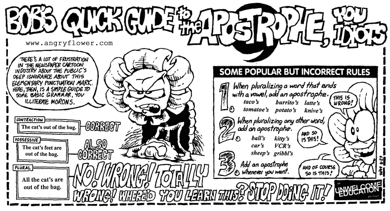
“its” vs. “it's”: “its” means “belonging to it”. “it's” means “it is”. If you can replace “its”/“it's” with “it is”, then put in the apostrophe. If you can't, don't put it in. In general, and contrary to popular belief, the apostrophe doesn't mean “an s will follow”. Other rules on apostrophes in graphical form, or check Oatmeal's guide; the esteemed Apostrophe Protection Society dedicates itself to proper usage of this oft-misunderstood punctuation mark.
Happy to see some efforts toward checking these things automatically!
Other good pages on this topic:
- Markus Kuhn's page at Cambridge
- Eddie Kohler's LaTeX Usage Notes
- Henning Schulzrinne's common-bugs-in-writing page at Columbia
John Owens | Last updated .